Flex 布局
介绍
Flex 是 Flexible Box 的缩写, 用来为盒状模型提供最大的灵活性,也被称为”伸缩布局”,”弹性布局”,”伸缩盒布局”,”弹性盒布局”。
任何容器都可以指定为 Flex 布局(包括行内元素)
设为 Flex 布局后,子元素的 float、clear 和 vertical-align 属性将失效,Flex 布局可以实现垂直居中
采用 Flex 布局的元素,称为 Flex 容器(flex container),简称”容器”。它的所有子元素自动成为容器成员,称为 Flex 项目(flex item), 简称”项目”。
容器的属性
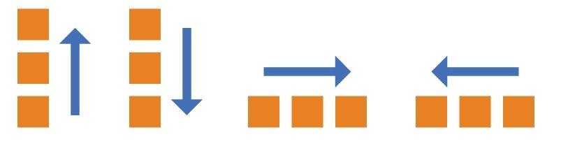
flex-direction 属性
flex-direction 属性决定主轴的方向,即项目的排列方向。
- row(默认值):主轴为水平方向,起点在左边
- row-reverse: 主轴为水平方向,起点在右边
- column:主轴为垂直方向,起点在上面
- column-reverse: 主轴为垂直方向,起点在下面
例子:
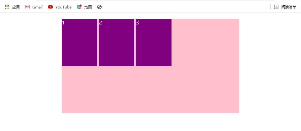
row:
1
2
3
4
5
6
7
8
9
10
11
12
13
14
15
16
17
18
19
20
21
22
23
24
25
26
27
28
29
30
31
32
33
34
35
36
37
38
39
40
41
|
<!DOCTYPE html>
<html lang="zh-CN">

<head>
	<meta charset="UTF-8">
	<meta http-equiv="X-UA-Compatible" content="IE=edge">
	<meta name="viewport" content="width=device-width, initial-scale=1.0">
	<title>Document</title>
</head>
<style>
	div {
		display: flex;
		/*设置为flex布局*/
		width: 60%;
		height: 300px;
		background-color: pink;
		margin: 20px auto;
		flex-direction: row;
		/*设置主轴为水平方向,起点在左边*/
	}

	span {
		width: 20%;
		height: 150px;
		background-color: purple;
		margin-right: 5px;
		color: #fff;
	}
</style>

<body>
	<div>
		<span>1</span>
		<span>2</span>
		<span>3</span>
	</div>
</body>

</html>
|
结果:
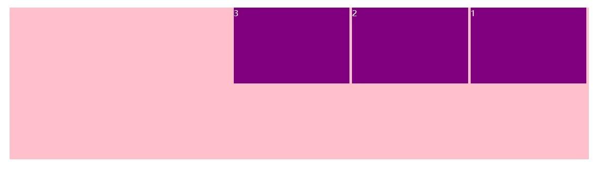
row-reverse:
flex-direction: row-reverse;
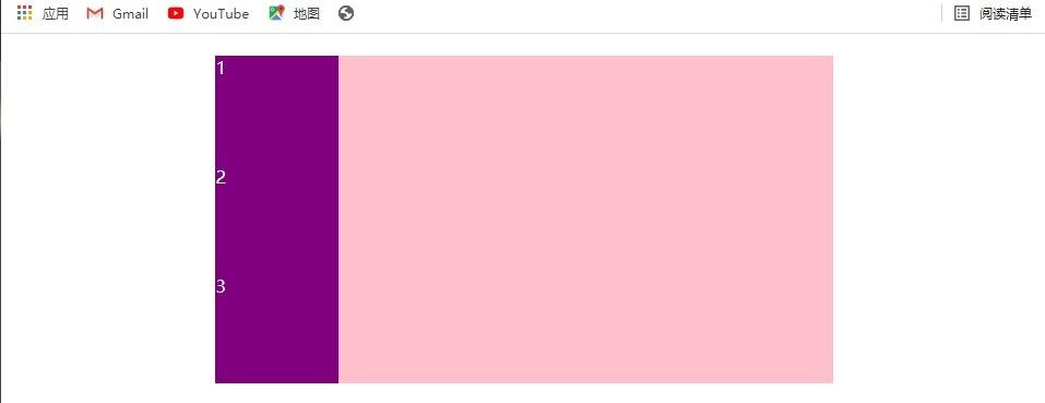
column:
1
2
3
4
5
6
7
8
9
10
11
12
13
14
15
16
17
18
19
20
21
22
23
24
25
26
27
28
29
30
31
32
33
34
35
36
37
38
39
40
41
|
<!DOCTYPE html>
<html lang="zh-CN">

<head>
	<meta charset="UTF-8">
	<meta http-equiv="X-UA-Compatible" content="IE=edge">
	<meta name="viewport" content="width=device-width, initial-scale=1.0">
	<title>Document</title>
</head>
<style>
	div {
		display: flex;
		/*设置为flex布局*/
		width: 60%;
		height: 300px;
		background-color: pink;
		margin: 20px auto;
		flex-direction: column;
		/*设置主轴为垂直方向,起点在上面*/
	}

	span {
		width: 20%;
		height: 150px; /*这里3个span的高度总和大于父元素的300px,但结果会和100px相同*/
		background-color: purple;
		margin-right: 5px;
		color: #fff;
	}
</style>

<body>
	<div>
		<span>1</span>
		<span>2</span>
		<span>3</span>
	</div>
</body>

</html>
|
结果:
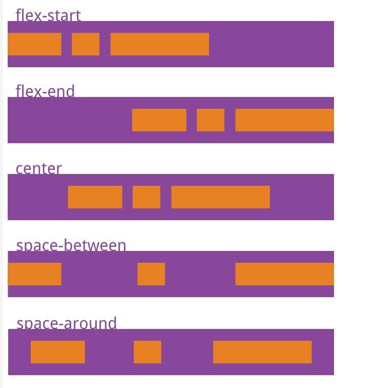
justify-content 属性
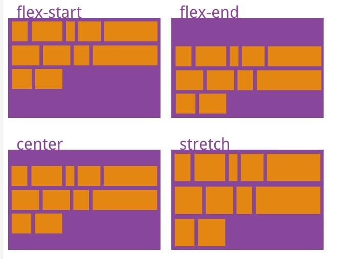
justify-content 属性定义了项目在主轴上的排列方式
- flex-start(默认值):左对齐
- flex-end:右对齐
- center:居中
- space-between:先两端对齐,之后剩下的项目平分剩余空间。项目之间的间隔相等
- space-around:所有项目平分剩余空间。每个项目两侧的距离相等。项目之间的距离比项目与边框的间隔大一倍。
flex-wrap 属性
flex-wrap 属性定义如果一条轴线排不下所有项目,是否换行
- nowrap(默认):不换行
- wrap:换行
nowrap:
1
2
3
4
5
6
7
8
9
10
11
12
13
14
15
16
17
18
19
20
21
22
23
24
25
26
27
28
29
30
31
32
33
34
35
36
37
38
39
40
41
42
43
44
45
46
47
|
 <!DOCTYPE html>
 <html lang="zh-CN">

 <head>
 	<meta charset="UTF-8">
 	<meta http-equiv="X-UA-Compatible" content="IE=edge">
 	<meta name="viewport" content="width=device-width, initial-scale=1.0">
 	<title>Document</title>
 </head>
 <style>
 	div {
 		display: flex;
 		width: 60%;
 		height: 400px;
 		background-color: pink;
 		margin: 20px auto;
 		flex-wrap: nowrap;
/*设置为不换行,默认也是不换行*/
 	}

 	span {
 		width: 20%;
 		height: 150px;
 		background-color: purple;
 		margin-right: 5px;
 		color: #fff;
 	}

     div span:nth-child(2n) {
 		width: 30%;
 	}
 </style>

 <body>
 	<div>
 		<span>1</span>
 		<span>2</span>
 		<span>3</span>
 		<span>4</span>
 		<span>5</span>
 		<span>6</span>
 	</div>
 </body>

 </html>
|
结果:
wrap:
把上面的代码带注释部分变成flex-wrap: wrap;
结果:
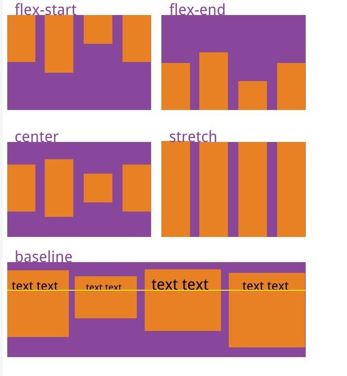
align-items 属性
align-items 属性定义侧轴上的子元素排列方式(单行)
- flex-start: 侧轴起点对齐
当主轴为水平方向时,侧轴为垂直方向,起点为上边,终点为下边;当主轴为垂直方向时,侧轴为水平方向,起点为左边,终点为右边 2. flex-end:侧轴终点对齐 3. center:侧轴中点对齐(垂直居中) 4. stretch(默认值):如果项目没有设置高度或者高度设置为 auto,则占满整个容器的高度,主轴为垂直方向时,则换宽度 5. baseline:项目的第一行文字的基线对齐
align-content 属性
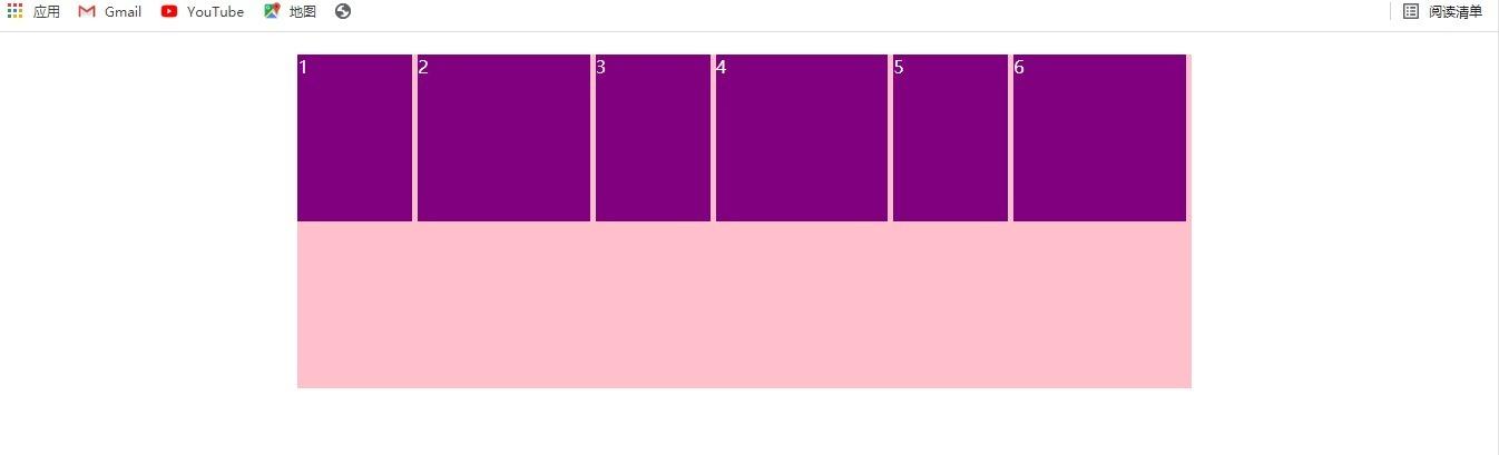
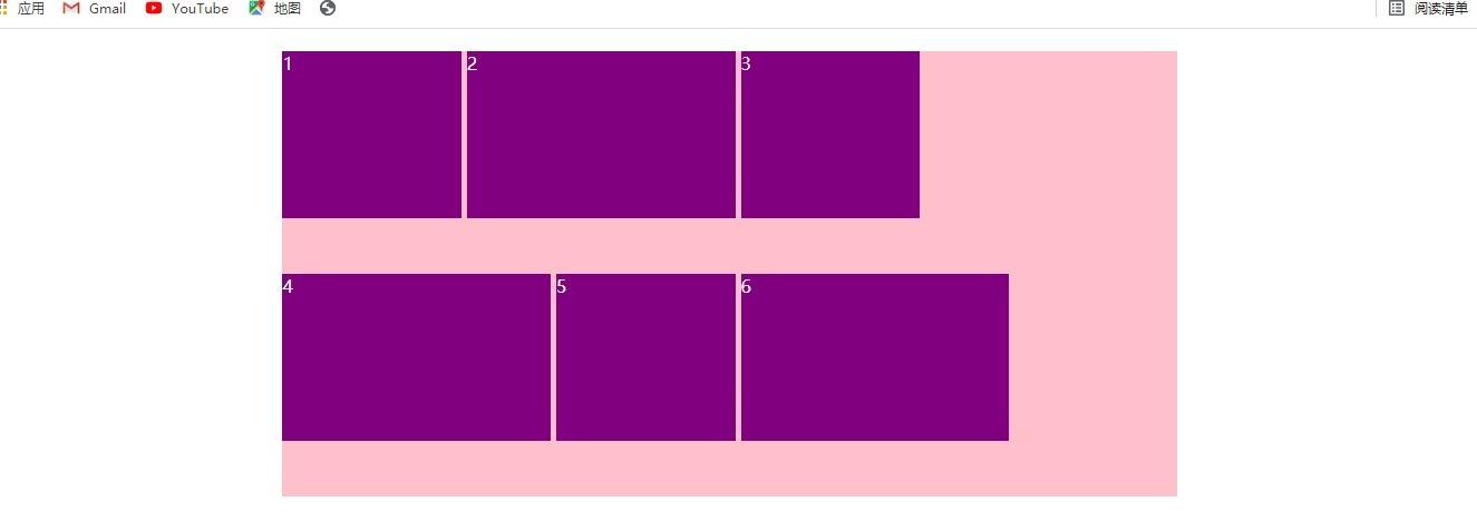
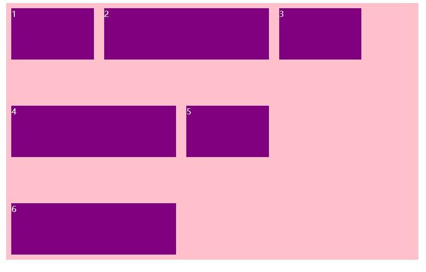
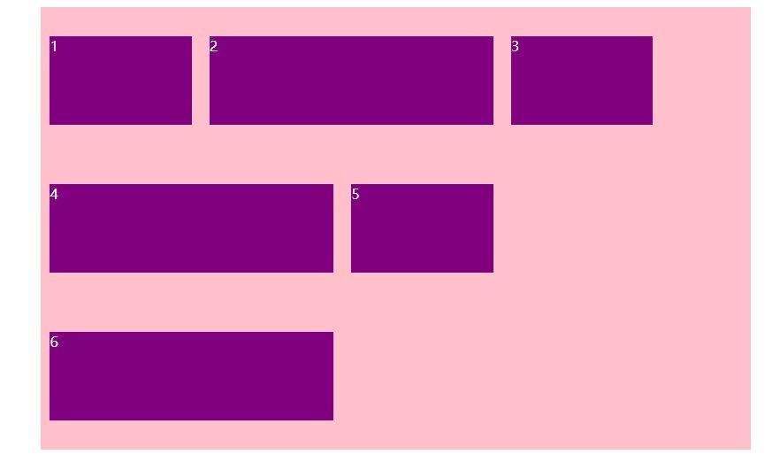
align-content 属性定义侧轴上的子元素排列方式(多行)
只能用于项目出现换行的情况,在单行下没有效果
- flex-start: 侧轴起点对齐
- flex-end:侧轴终点对齐
- center:侧轴中点对齐(垂直居中)
- space-between:子项在侧轴先分布在两头,再平分剩余空间。
- space-around:子项在侧轴平分剩余空间。
- stretch(默认值):设置子项元素平分父元素高度
space-between:
1
2
3
4
5
6
7
8
9
10
11
12
13
14
15
16
17
18
19
20
21
22
23
24
25
26
27
28
29
30
31
32
33
34
35
36
37
38
39
40
41
42
43
44
45
46
47
48
|
<!DOCTYPE html>
<html lang="zh-CN">

<head>
	<meta charset="UTF-8">
	<meta http-equiv="X-UA-Compatible" content="IE=edge">
	<meta name="viewport" content="width=device-width, initial-scale=1.0">
	<title>Document</title>
</head>
<style>
	div {
		display: flex;
		width: 60%;
		height: 500px;
		background-color: pink;
		margin: 20px auto;
		flex-direction: row;
		align-content: space-between;
		flex-wrap: wrap;
	}

	span {
		width: 20%;
		height: 100px;
		background-color: purple;
		margin: 10px;
		color: #fff;
	}

	div span:nth-child(2n) {
		width: 40%;
	}
</style>

<body>
	<div>
		<span>1</span>
		<span>2</span>
		<span>3</span>
		<span>4</span>
		<span>5</span>
		<span>6</span>
	</div>
</body>

</html>
|
结果:
space-around:
1
2
3
4
5
6
7
8
9
10
11
12
13
14
15
16
17
18
19
20
21
22
23
24
25
26
27
28
29
30
31
32
33
34
35
36
37
38
39
40
41
42
43
44
45
46
47
48
|
<!DOCTYPE html>
<html lang="zh-CN">

<head>
	<meta charset="UTF-8">
	<meta http-equiv="X-UA-Compatible" content="IE=edge">
	<meta name="viewport" content="width=device-width, initial-scale=1.0">
	<title>Document</title>
</head>
<style>
	div {
		display: flex;
		width: 60%;
		height: 500px;
		background-color: pink;
		margin: 20px auto;
		flex-direction: row;
		align-content: space-around;
		flex-wrap: wrap;
	}

	span {
		width: 20%;
		height: 100px;
		background-color: purple;
		margin: 10px;
		color: #fff;
	}

	div span:nth-child(2n) {
		width: 40%;
	}
</style>

<body>
	<div>
		<span>1</span>
		<span>2</span>
		<span>3</span>
		<span>4</span>
		<span>5</span>
		<span>6</span>
	</div>
</body>

</html>
|
结果:
flex-flow 属性
flex-flow 属性是 flex-direction 属性和 flex-wrap 属性的简写形式,默认值为 row nowrap。flex-flow: row nowrap;
项目的属性
flex 属性
flex 属性定义子项目分配剩余空间,用 flex 来表示占多少份数,可以是百分比形式,其中百分比是相对与容器(即父级)来说的。
1
2
3
4
5
6
7
8
9
10
11
12
13
14
15
16
17
18
19
20
21
22
23
24
25
26
27
28
29
30
31
32
33
34
35
36
37
38
39
40
41
42
43
44
45
| <!DOCTYPE html>
<html lang="zh-CN">
<head>
<meta charset="UTF-8">
<meta http-equiv="X-UA-Compatible" content="IE=edge">
<meta name="viewport" content="width=device-width, initial-scale=1.0">
<title>Document</title>
</head>
<style>
div {
display: flex;
width: 60%;
height: 130px;
background-color: pink;
margin: 20px auto;
flex-wrap: wrap;
}
div p {
color: #fff;
}
div p:nth-child(2n+1) {
width: 100px;
height: 100px;
background-color: purple;
}
div p:nth-child(2) {
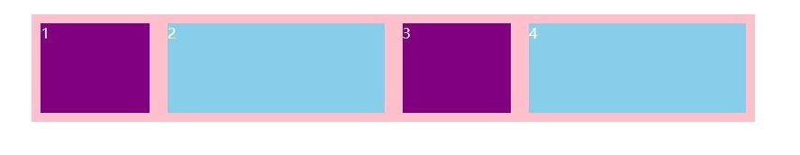
flex: 1;
background-color: skyblue;
}
</style>
<body>
<div>
<p>1</p>
<p>2</p>
<p>3</p>
</div>
</body>
</html>
|
结果:
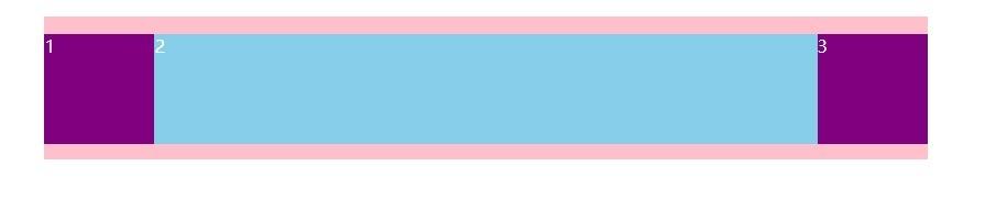
上图分析:紫色项目有宽度,蓝色项目没有宽度,蓝色项目添加了flex:1,所以蓝色项目占满剩余空间。
1
2
3
4
5
6
7
8
9
10
11
12
13
14
15
16
17
18
19
20
21
22
23
24
25
26
27
28
29
30
31
32
33
34
35
36
37
38
39
40
41
42
43
44
45
|
<!DOCTYPE html>
<html lang="zh-CN">

<head>
	<meta charset="UTF-8">
	<meta http-equiv="X-UA-Compatible" content="IE=edge">
	<meta name="viewport" content="width=device-width, initial-scale=1.0">
	<title>Document</title>
</head>
<style>
	div {
		display: flex;
		width: 60%;
		height: 120px;
		background-color: pink;
		margin: 20px auto;
		flex-wrap: wrap;
	}

	span {
		height: 100px;
		background-color: purple;
		margin: 10px;
		color: #fff;
		flex: 1;
	}

	div span:nth-child(2n) {
		flex: 2;
		background-color: skyblue;
	}
</style>

<body>
	<div>
		<span>1</span>
		<span>2</span>
		<span>3</span>
		<span>4</span>
	</div>
</body>

</html>
|
结果:
分析:
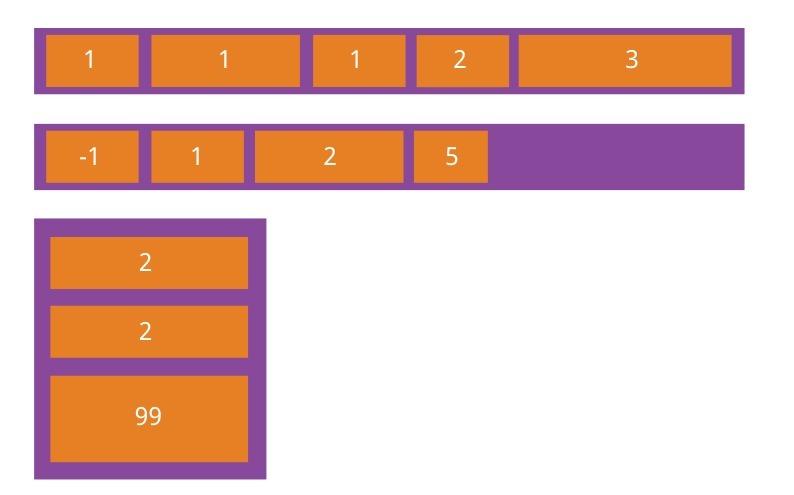
子项目都没有宽度,最后按 flex 的占比分配剩余空间,如第一个紫色项目占剩余空间 1/(1 + 2 + 1 + 2) = 1 /6
align-self 属性
align-self 属性控制子项自己在侧轴上的排列方式,允许单个项目有与其他项目不一样的排列方式,可覆盖 align-items 属性。默认值为 auto,表示继承父元素的 align-items 属性,如果没有父元素,则等同于 stretch。
1
2
3
4
5
6
7
8
9
10
11
12
13
14
15
16
17
18
19
20
21
22
23
24
25
26
27
28
29
30
31
32
33
34
35
36
37
38
39
40
41
42
| <!DOCTYPE html>
<html lang="zh-CN">
<head>
<meta charset="UTF-8">
<meta http-equiv="X-UA-Compatible" content="IE=edge">
<meta name="viewport" content="width=device-width, initial-scale=1.0">
<title>Document</title>
</head>
<style>
div {
display: flex;
width: 60%;
height: 300px;
background-color: pink;
margin: 20px auto;
align-items: flex-start;
}
span {
width: 20%;
height: 100px;
background-color: purple;
margin: 10px;
color: #fff;
}
div span:nth-child(2n) {
align-self: flex-end;
}
</style>
<body>
<div>
<span>1</span>
<span>2</span>
<span>3</span>
</div>
</body>
</html>
|
结果:
order 属性
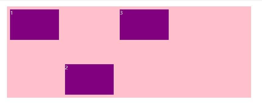
order 属性定义项目的排列顺序。数值越小,排列越靠前,默认值为 0,可以为负数。order: -1;
flex-shrink 属性
flex-shrink 属性定义了项目的缩小比例,默认为 1,即如果空间不足时,该项目将缩小。flex-shrink: 1;
如果所有项目的 flex-shrink 属性都为 1,当空间不足时,都将等比例缩小。如果一个项目的 flex-shrink 属性为 0, 其他项目都为 1,则当空间不足时,前者不缩小。
flex-shrink 属性是导致当容器的 flex-wrap 属性为 nowrap 时,所有项目不会换行的原因。
参考链接:https://www.runoob.com/w3cnote/flex-grammar.html
pink 老师前端入门教程