laxjs使用
前言
体验一下各种动画库的使用。
使用
laxjs跟一些常见的动画库(animejs、gsap)的使用方式差异较大。animejs它们主要是获取dom元素,然后设置终点的样式,来进行动画。
如:
1 | |
而laxjs则是通过addDriver添加驱动,通过添加的驱动来实现动画。
驱动的值是任意的,不过更常见的是通过滚动驱动(laxjs官方介绍就是
create smooth & beautiful animations when you scroll)
简单使用:
1 | |
效果:
lax.addElements第一个参数不支持直接传dom元素,所以在react中没法使用
useRef来操作dom元素。
lax使用主要分为三个步骤:
- 初始化。
lax.init - 添加驱动,第一个参数是驱动名称,第二个参数是一个返回数字的函数,该函数每帧都会被调用,值用于动画。
lax.addDriver - 添加元素,第一个参数是选择器,第二个参数是一个对象,key为驱动名称,value是样式映射的一个对象。
比如上面的:
1 | |
就意味着,当window.scrollY为0时,opacity的值为1,window.scrollY为200时,opacity的值为0。opacity跟window.scroolY的关系是线性关系,即当window.scrollY为100时,opacity的值会是0.5。
当值映射有多个值时,线性关系也会分段。(下面的0-200为一段,200-800为另一段)
官方例子:
1 | |
还可以使用lax内置的一些常用值: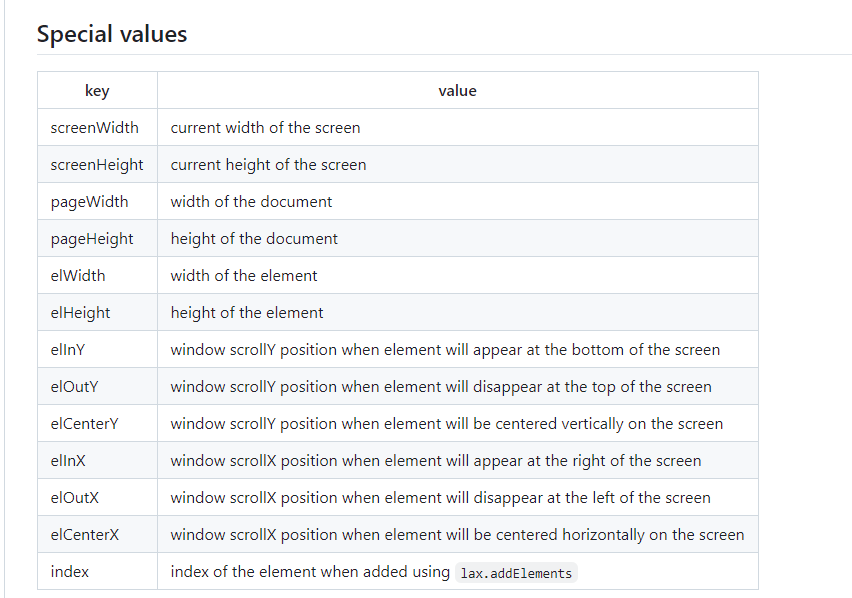
lax官网动效分析
看完laxjs的官方文档后,对lax的使用也有了一些了解,再加上lax本身就有一个比较简单的官网动效,而且代码并没有经过压缩混淆,所以可以分析一下官网动效,来稍微加深一下对lax的理解(有一些地方可以做了些许调整)
共同代码(初始化、驱动程序):
1 | |
logo文字
logo部分的html结构
1 | |
js
1 | |
图片换成在iconfont上切的图片了
C和L的动效比较浅显易懂,开始滚动的时候,透明度逐渐变小,到屏幕一半的时候完全隐藏,与此同时,C向右偏移,L向左偏移。(文字都是fixed定位,所以不会出现往上走的情况)
Z的动效就有一点点特殊。滚动开始到100像素的时候,Z向下偏移,然后开始逐渐放大。这里的透明度还做了一个分段处理:滚动到一半这个周期,透明度不发生变化,一半之后到首屏消失,透明度逐渐减小为0
scroll down文字
整体跟logo文字差不多,不过,处理的样式是letter-spacing,跟translate系列不一样,需要额外参数cssUnit: "px"来设置属性
1 | |
漂移文字
1 | |
整体还是跟logo文字一样(万变不离其宗🐕),用到了
lax内置的一些特殊值。当haha这个元素出现的时候(window.scrollY === elInY),开始偏移,当它消失的时候(window.scrollY === elOutY)时,偏移达到screenWidth-200。pass元素还额外处理了一下skewX属性,会有一个出现到消失,倾斜从向左逐渐变成向右。
旋转纸片
1 | |
这里的动效因为是针对多个元素的,所以上面会有比较多的Math.random()
属性较多,按属性分析:
1
2
3
4translateY: [
["screenHeight/4", "screenHeight * 3"],
["Math.random()*screenHeight", "Math.random()*screenHeight*3"],
],设置初始值为
Math.random()*screenHeight,就避免了所有元素一开始都在同一起跑线,而第二个random则是为了在滚动过程中会有变化,才会有”超车”这种情况发生。1
translateX: [[0], ["index*(screenWidth/25)-50"]],
水平线上的位置只有一个值,所以不会有变化。可以通过
index来设置初始值,比如当screenWidth为1000px时,第一个元素的translateX为-50,第二个元素的translateX为1*(1000/25)-50 = -10,依次类推。(实际上就是screenWidth/25的一个等差数列)
1
2
3
4
5
6
7
8
9
10
11
12
13transform: [
[0, 4000],
[0, "(Math.random() + 0.8) * 1000"],
{
cssFn: function (val: number) {
return `rotateX(${val % 360}deg)`;
},
},
],
rotate: [
[0, 4000],
[0, "(Math.random() - 0.5) * 1000"],
],
这两个都是旋转,区别是rotate是二维的,而rotateX是三维的,rotateX可以有种纸片在正对我们旋转的感觉。上面因为transform只需要额外设置rotateX,所以用到了cssFn处理样式,还加了一下取余做一些优化。
最终效果

完整代码
tsx
1 | |
css
1 | |
c.svg
1 | |
l.svg
1 | |
z.svg
1 | |